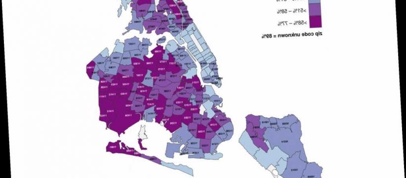
A new city map showing percent of patients testing positive for coronavirus by ZIP code suggests the poorest New Yorkers are hardest hit by the pandemic.
The wealthiest parts of the city, including most of Manhattan and waterfront sections of Queens and Brooklyn, have the lowest percentage of people testing positive for the virus, according to the map released by the city Department of Health.
The map is flawed in that it does not incorporate the overall number of tests given, just the positivity rate of tests taken. The city’s health commissioner has warned that it largely reflects testing behavior of medical providers.
But data scientist Michael Donnelly, who’s been crunching the city’s coronavirus numbers since the start of the outbreak, noted the testing map tracks with earlier turnstile data.
Those maps showed ridership plummeting in Manhattan stations in mid-March, while New Yorkers from the outer reaches of the outer boroughs continued commuting.
“Over time we start to see the effect of the fact that Manhattan and the inner zip codes of Queens and Brooklyn have a lower positive rate because they were able to bend the curve before the outer boroughs,” Donnelly said. Many of those residents have white-collar jobs that allow for telecommuting.
“I think the clear next step there, is if that’s true, then there’s a real socio-economic inequality, inequity in the fact that these ZIP codes, which also tend to skew lower socio-economic, are also going to be the ones who are harder hit by this pandemic,” Donnelly said.
“Broad strokes, those tend to be the wage workers, emergency service workers that are exposing themselves more and more over time,” Donnelly said. Many front-line workers, from grocery store clerks to EMTs, live in the outer boroughs. Their jobs require them to use the subways while the majority of New Yorkers stay home.
The map does not track with age. The borough with the highest percentage of elderly — Manhattan — has the lowest rate of residents testing positive as well as the fewest confirmed COVID-19 cases behind Staten Island, Donnelly said.
Meanwhile, the youngest boroughs — The Bronx followed by Brooklyn — have some of the highest numbers of confirmed cases and percentage of patients testing positive. Queens, which has an average in terms of age, is the epicenter of the city’s outbreak.
There’s also the possibility that Manhattan doctors are testing more mild cases than the outer boroughs, Donnelly said. That’s a scenario that is backed by city Health Commissioner Dr. Oxiris Barbot.
“This map tells us about testing behavior. It doesn’t tell us anything about how the virus is being transmitted,” Barbot said at a recent City Hall press conference, referring to an earlier, less detailed version of the data.
“What the map shows is the variability in terms of, if you could think about it as hit rate, meaning that there are some parts of the city, Brooklyn and Queens, where providers are being more judicious in terms of who it is that they’re testing.
“And that in other parts of the city, you still have a ways to go in terms of ensuring that we are reserving testing for those individuals who are not getting better and who fall into those chronic underlying illnesses,” Barbot said.
“I wouldn’t make anything more of the map other than it reflects testing behavior of providers,” Barbot said.
Related Video
Doctor in Netflix’s ‘Pandemic’ says he discovered potential coronavirus cure
Barbot and Mayor Bill de Blasio have promised to release more raw data to better understand how the virus is affecting New Yorkers.
Source: Read Full Article