One of the main characters of Apple TV+’s “The Afterparty” creates escape rooms for a living, but it’s the show itself that is designed as an intricate puzzle box, able to support dips into genres as wildly divergent as action adventure is from black-and-white arthouse. The conceit of the show adds a little formal playfulness to its already hot gos–laced whodunit. As Detective Danner (Tiffany Haddish) asks guests at a high school reunion afterparty hosted by a just-murdered classmate and celebrity (Dave Franco), each guest recounts their nights as their individual “mind movies,” with each episode adopting a different tone and focus. But the locations for each guest’s wildly divergent recollections have to remain more or less the same. IndieWire spoke with production designer Bruce Hill to ask how he created such a versatile Rubik’s Cube of a set.
“It really took a lot of coordination with the DP and the costume designer, Carl Herse and Tracy Gigi Field,” Hill said. “We had a set [that had] a lot of recess lighting and a lot of cove lighting, and all that cove lighting is digital. It’s all LEDs. And so you can turn it into any temperature of light and color, you know, all these different variables that you can use to kind of help control the look.” The flexibility of that look gets put to work in the first four episodes of the show, which variously take on the spirit of modern rom-coms, psychological thrillers, Bayhem action movies, and full-fledged musical numbers.
Ben Schwartz in “The Afterparty”
Courtesy of Apple+
A lot of the yeoman’s work is done with lighting, as the warm tones of the rom-com give way to a steely blue sheen (one might even say a Blue Steel one) for the actioner, to the choreographed spotlights of the musical numbers to a much more desaturated color palette for the thriller. But the set is also pulling its weight, as Hill added subtle touches that helped accentuate the genre-of-the-week. “When we’re in the rom-com, we lean in that direction. And so we will dress in more flowers and we’ll dress them in different sorts of colors, to coordinate as best we could to define each of these episodes and each of these stories.”
It was important to Hill that the architecture of the house itself support the variety of tones and genre conceits at the foundation of the series. That created an extra challenge when it came to designing interiors to be shot on stage and matched up with an exterior location for Xavier’s second beach house. “We had to start designing the inside before we really locked down the outside, which was a little bit nerve wracking, but eventually we went with the Sunset Plaza House, which was designed by the Belzberg architects and it’s a beautiful, beautiful location,” Hill said. “Once we finally found out which house it was, then we had to match the exterior entrance with our interior set. There was a reflecting pool and some stairs and planters that we had to put out there, but it tied in very nicely.”
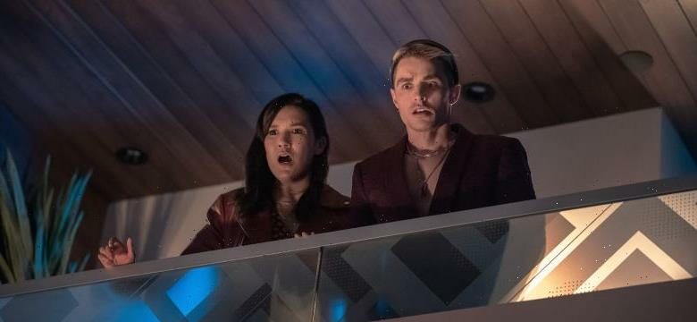
Zoe Chao in “The Afterparty”
Courtesy of Apple+
But the look also had to change on a dime, as the shooting schedule would often combine different episodes on the same shooting day — hence the need for creating enclaves inside the same living room space that could support different feels for different episodes. For instance, the open-plan kitchen looks unassuming and intimate in Aniq’s (Sam Richardson) episode, supporting his quest to confess his feelings for Zoe (Zoe Chao), but with its long lines and nook off to the side, Walt (Jamie Demetriou) can spring out of nowhere to interrupt a conversation in the same place during the thriller episode.
Both the interiors designed by Hill and the exteriors share sharp lines and angles, as well as different levels that allow characters to eavesdrop and spy. As much as “The Afterparty” is itself playing with different character and tonal perspective, the set supports this by creating spaces with room for multiple perspective as well.
Ike Barinholtz, Ilana Glazer, and Tiffany Haddish in “The Afterparty”
Courtesy of Apple+
Director Christopher Miller is canny in how he holds back angles on the open-plan living room to get the most generic feel out of them, and even holds certain areas of the house entirely so they can appear fresh for a specific bravura sequence — like the poolside in which Yasper’s (Ben Schwartz) soulful ballad “Three Dots From Stardom” begins in Episode 3 or the side cabin full of mildly terrifying merch the detectives explore in Episode 4.
“We wanted to give [the spaces] as many levels and as [many] interesting ways of going into the space or getting out of the space,” Hill said. “Even having all these different characters in different areas so that you can see as many [people as possible in one shot], you can still keep sight lines open for people.” The variety and depth built into the set allows the show to return to the same place again and again in new ways, and there are even more ways the show will use its house before the series is over. “Right now I’m watching the series with just the eyes of looking at how things turned out,” Hill said. “But for those that look closely, there are even other layers that exist.”
Source: Read Full Article


