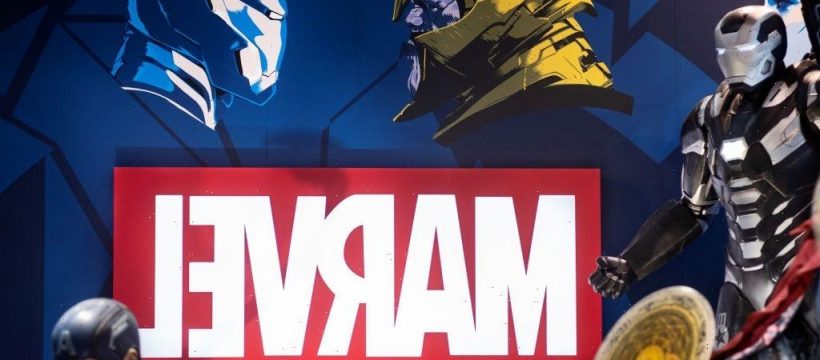
The Marvel Cinematic Universe (MCU) has brought scores of new fans into the Marvel world, but true fans know that it is more than just the MCU. In addition to the comics, which provide the source material for the movies and TV shows, the franchise also has an extensive line of video games. While Stan Lee is considered the godfather of Marvel, he was not the original publisher or creator. The franchise had a different name and a radically different logo.
Is Marvel the most successful comic franchise?
The answer to that depends on how success is measured and is frankly worthy of its own article. There is no doubt that, by most measures, Marvel is incredibly successful. Created in 1939 as Timely Comics, the company now known as Marvel Comics hired 16-year-old Stanley Lieber in 1939 and appointed him as editor in 1941.
Lieber is better known as Stan Lee, a pseudonym he created when he started writing comics. Lee ushered in the Marvel Age of Comics in 1961, and the rest, as they say, is history.
In 2008, the MCU, arguably the most popular, began with the release of Iron Man, which is still one of the most popular MCU movies. According to Rotten Tomatoes, it is the third-best movie, behind Avengers: Endgame in second and Black Panther in first. After the Infinity Saga concluded in 2019, Phase Four officially began in 2021 and included WandaVision, The Falcon and the Winter Soldier, and Loki, the first official television shows considered canon.
How has the Marvel logo changed over the years?
Since it began in 1939, the logo had changed several times, particularly when the company name was different. According to Screen Rant, the original Timely Comics logo was a red, white, and blue shield that was incredibly similar to Captain America’s original shield. In the 1950s, Timely Comics changed its name to Atlas Comics and the logo, which was changed to a globe. And by 1957, the logo changed to a red circle with Marvel Comics written in white. A brief version of the logo was simply the letter M printed above the letter C, but a Marvel Comics Group logo soon replaced it.
The logo did not change very much until the early 1990s when a more stylized logo was created, with Marvel in big red, block letters, and Comics written in a yellow, curvy font. In the early 2000s, the logo changed to Marvel, written in white block letters on a red background, which is the main logo used today. Of course, the MCU logo has changed quite a bit since 2008, initially using a fundamental Marvel Studios logo that eventually shifted into the flashy logo we have today.
What is up next?
Phase Four continues with Shang-Chi and the Legend of the Ten Rings, followed by Eternals on the big screen, and What If…?, followed by Hawkeye on Disney+. In October of 2021, the latest video game, Marvel’s Guardians of the Galaxy, is set to be released. As far as comics go, the franchise continues to release new issues of popular series such as Thor, The Amazing Spider-Man, and introduce new ones, including Kang the Conqueror.
Changing logo designs over a 70-plus year history is not unique to Marvel. Companies and corporations are constantly changing their logos. But it is pretty interesting to see the evolution of the Marvel logo over the years. Plus, it is always fun to delve into the history of Marvel Comics, particularly for true fans who wouldn’t hesitate to say Marvel is way more successful than another comic franchise that will remain nameless.
Source: Read Full Article

